
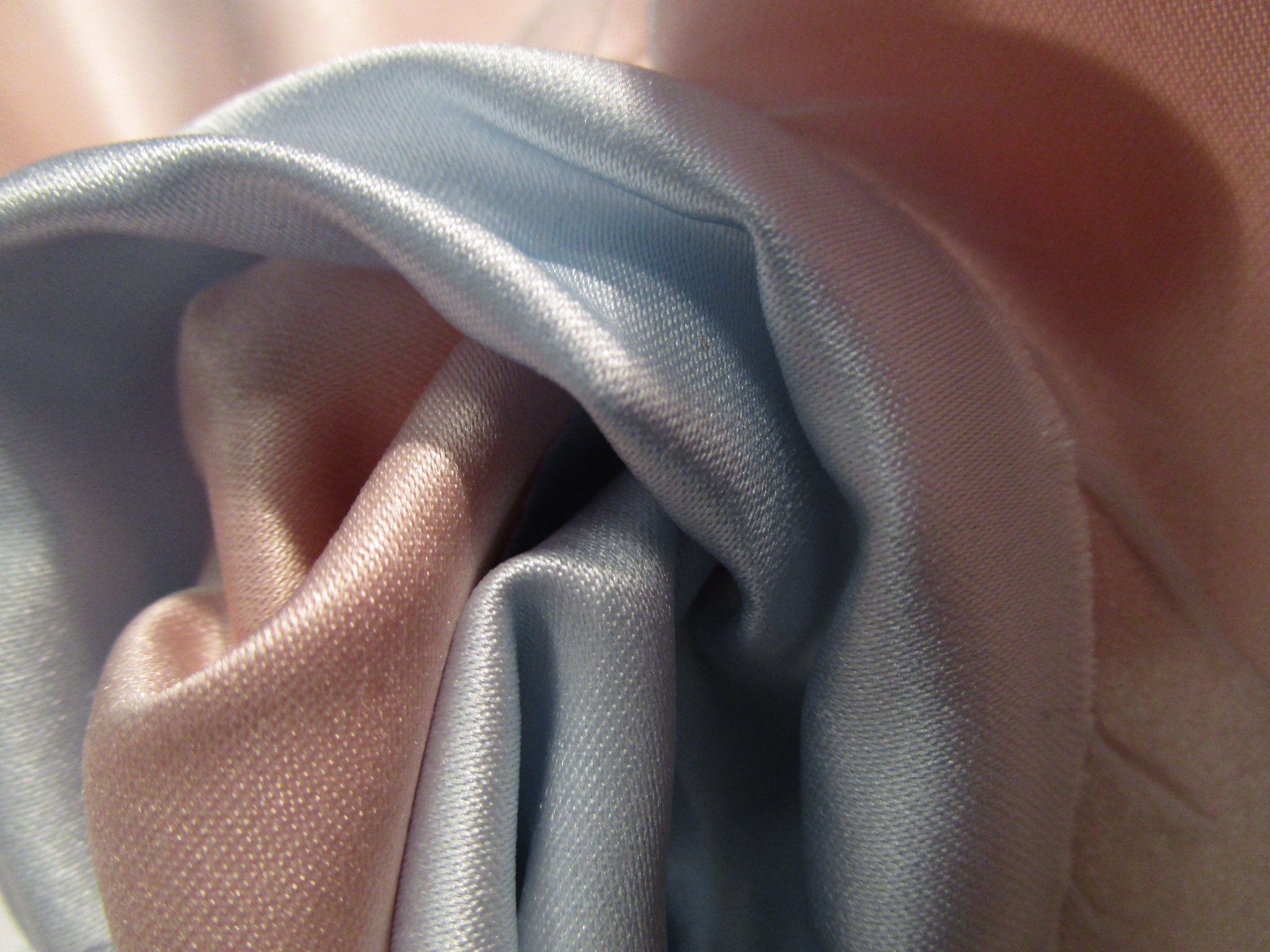
 The 2016 Pantone Color of the Year pick offers a “softer take on color”. Rose Quartz and Serenity both are comforting shades that promote harmony and wellness. Offering a reprieve from the chaos we often face in our always-connected, ever-evolving world, these light pink and blue shades feel good.
The options for incorporating these colors into your environment are expansive. Mystique Satin brings a luster to these pastels while providing a smooth, silky hand. Using these shades in your graphics can soften the imagery and invite the viewer to sit and relax, finding comfort in your environment.
Valerie "Poly Georgette" has a passion for textiles and construction. She enjoys developing solutions utilizing a number of different substrates to dress a space. She has ten years of experience creating custom solutions and tracking down a plethora of amazing textiles, consistently dreaming up new ways to use them.
Valerie “Poly Georgette” has a passion for textiles and construction. She enjoys developing solutions utilizing a number of different substrates to dress a space. She has ten years of experience creating custom solutions and tracking down a plethora of amazing textiles, consistently dreaming up new ways to use them.